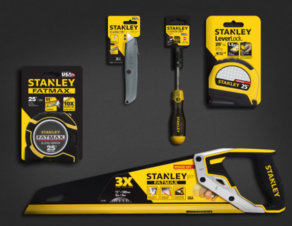
Stanley rolls out new logo
Stanley Black & Decker rolled out a new logo. It's still yellow and black. It still spells "Stanley." But it represents a new brand identity for the iconic tool brand and diverse industrial company.
“Stanley has undergone a tremendous transformation in the past 15 years,” said John F. Lundgren, chairman and CEO. “The brand now participates in a vast array of markets, from health care and security to engineered fastening and oil pipeline services to hand tools and power tools. We wanted a logo that truly represented the size and scope of the brand.”
The Stanley brand is 170 years old.
Working with global brand strategy and design consultancy Lippincott, the company came up with a new brand positioning that it describes as "Performance in Action."
The new logo is described as "more dynamic" and "an upward arrow-like triangle that speaks to the concept of 'action.' "
“Through our research and creative work with Lippincott, we were able to mine the common core of all of our Stanley-branded products and businesses,” said James M. Loree, president and chief operating officer. “That common thread is excellence in performance. Whether it is the tool a professional relies on, a security system that a school relies on or a pipeline service that an industry relies on, Stanley means performance.”
“In 170 years, we’ve had three basic logos,” said Scott Bannell, VP corporate brand management. “I believe that this new logo has the strength and power to carry us for decades to come.”
The last time the company modified the Stanley logo was 1995, continuing an evolution that has progressed for nearly two centuries.

