Introducing the 2017 colors of the year
With the rest of the world hot on the heels of Labor Day, the paint industry is already looking ahead to what 2017 will bring.
Specifically, it's time to make the call on what the 2017 Color of the Year will be.
Here are three interpretations from a few of the heavy hitters in the industry.
1. Glidden Paint: Byzantine Blue
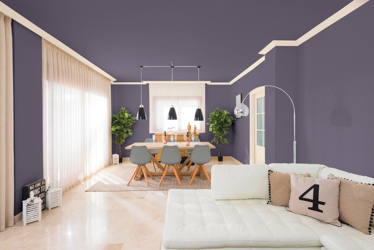
Glidden is feeling the soothing, peaceful colors this year, with the hue of choice appearing more gray or bluish purple depending on the other colors it's paired with.
“The name may say blue, but Byzantine Blue is truly a purple in disguise. It stretches the boundaries of purple to borrow all of best qualities of blue and gray, making it an appealing color choice for nearly any room,” said Misty Yeomans, PPG color marketing manager, Glidden paint
“Its unique versatility and incredible ability to bring out certain hues based on its surroundings make Byzantine Blue a perfect shade for all ages," added Yeomans. "It is also gender-neutral, making it easy to use throughout your home.”
 2. Pittsburgh Paints & Stains: Silverado
Also debuting a purplish-gray tone is Pittsburgh Paints & Stains, a PPG brand. However, the sentiment behind the choice is decidedly more far-out.
“PPG’s global color experts selected a striking purple hue for the Pittsburgh Paints & Stains brand 2017 Color of the Year after studying consumers’ growing fascination with space, spirituality, technology and time. Silverado perfectly mimics the deep, mysterious yet organic tones of outer space,” said Misty Yeomans, PPG color marketing manager, Pittsburgh Paints & Stains brand.
“With hints of gray, Silverado fits perfectly in many different environments due to its versatility and neutral nature,” Yeomans continued.
 3. Sherwin-Williams: Poised Taupe
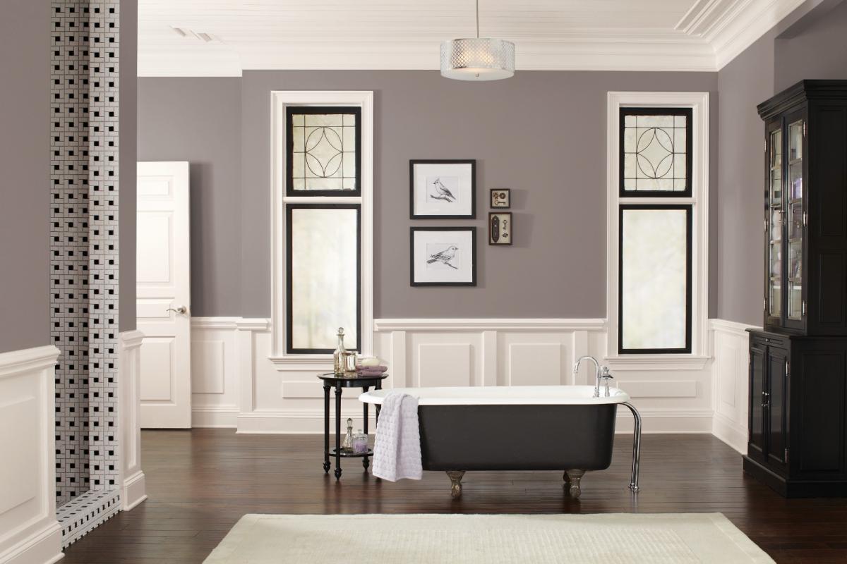
Billed as a "modern take on a timeless classic," Poised Taupe is all about straddling the divide between warm and cool tones.
"Poised Taupe celebrates everything people love about cool gray as a neutral, and also brings in the warmth of brown, taking a color to an entirely new level. Not cool or warm, nor gray or brown, Poised Taupe is a weathered, woodsy neutral bringing a sense of coziness and harmony that people are seeking," says Sue Wadden, director of color marketing for Sherwin-Williams.
The decision was made after observing a shift in the way consumers are approaching neutrals: less monochrome gray, and more complex taupe and brown. Additionally, a recent survey conducted by Sherwin-Williams found that nearly 40% would embrace warmer neutrals, such as warm grays, taupes or beiges. Additionally, more than two in five people identified taupe as a timeless neutral they would choose.
"Consumers yearn for spaces that feel welcoming and hug them as they enter. Earthen brown combined with conservative gray, creating Poised Taupe, embodies all of these emotions," says Wadden.


